CONTEXT
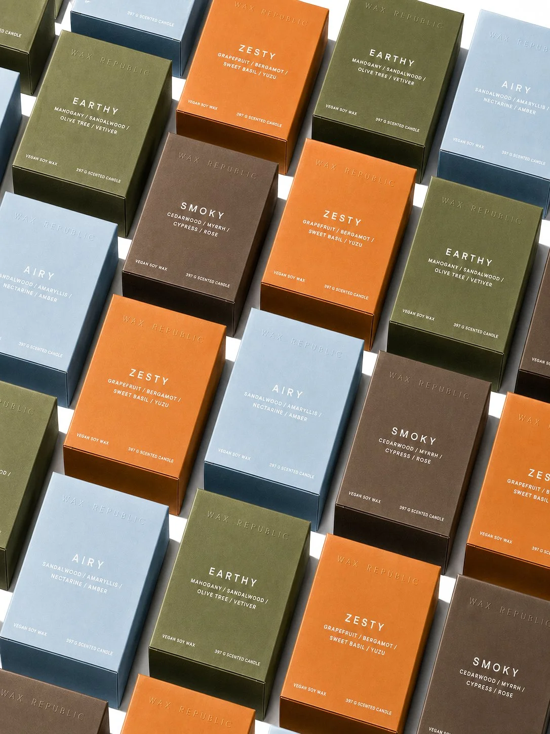
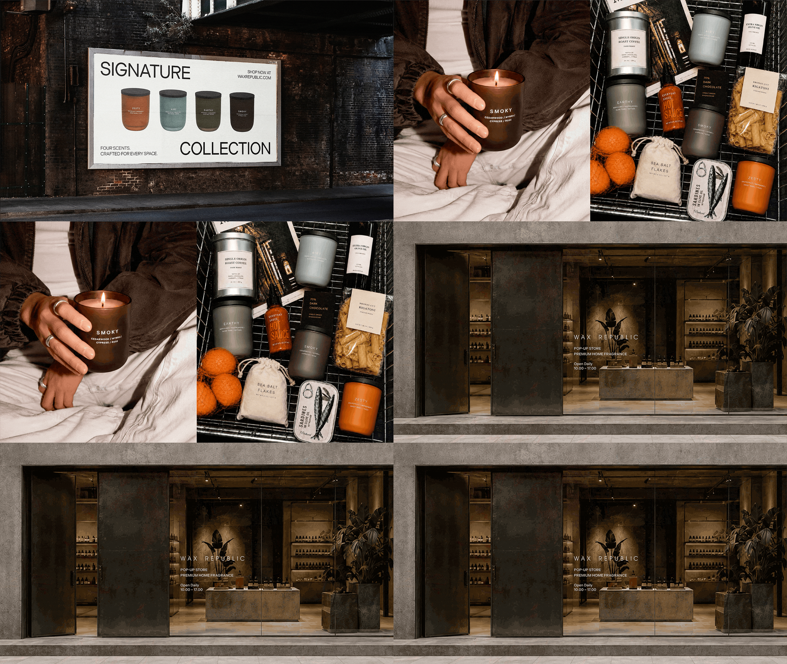
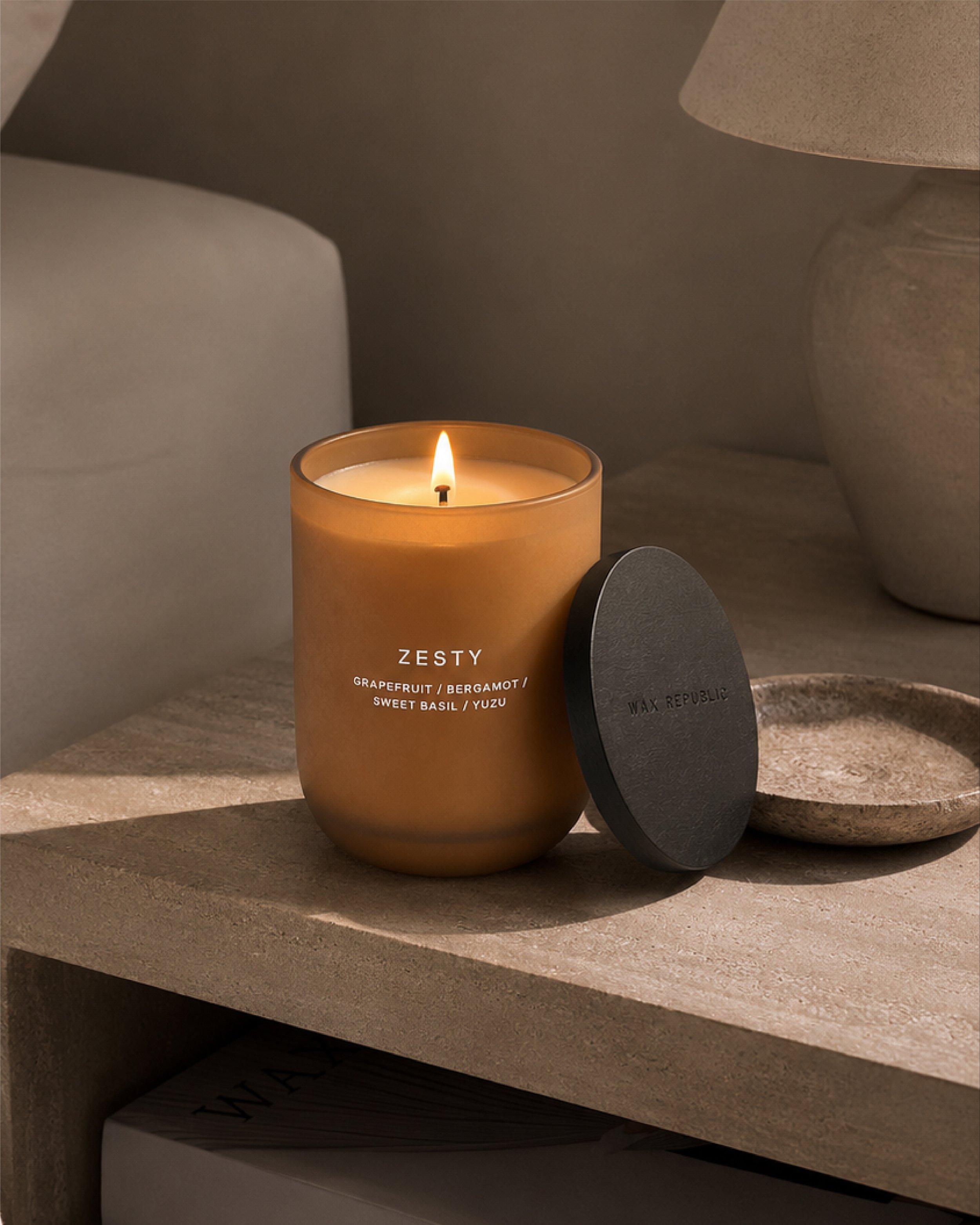
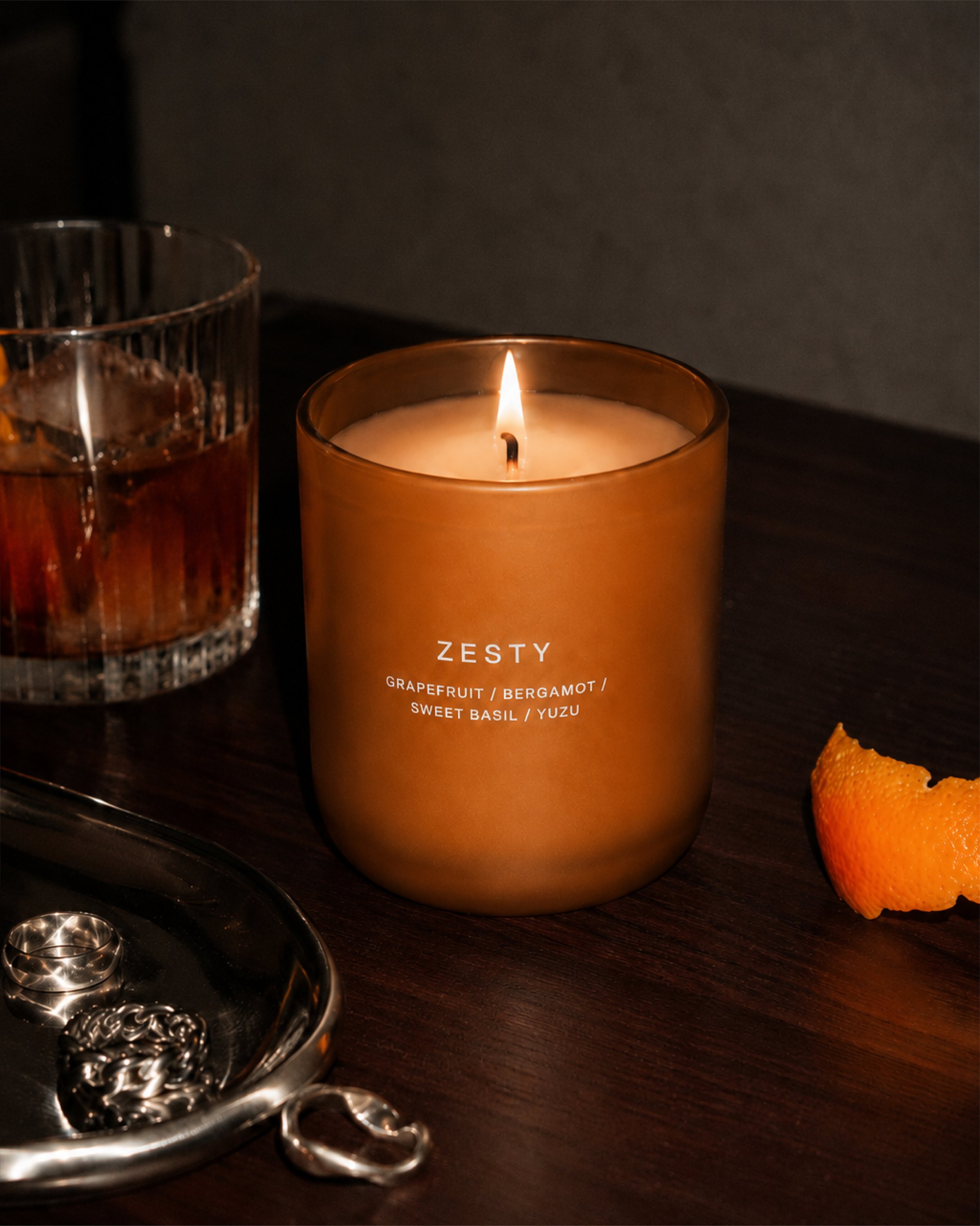
Wax Republic is a home fragrance brand inspired by unisex fragrances and utilitarian design. Although its ambition was to champion a ‘less is better’ philosophy, the brand lacked the cohesive identity, positioning and messaging needed to bring this vision to life.
THE CHALLENGE
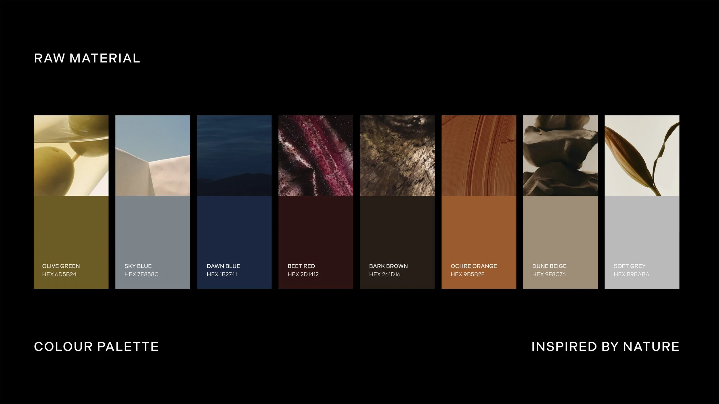
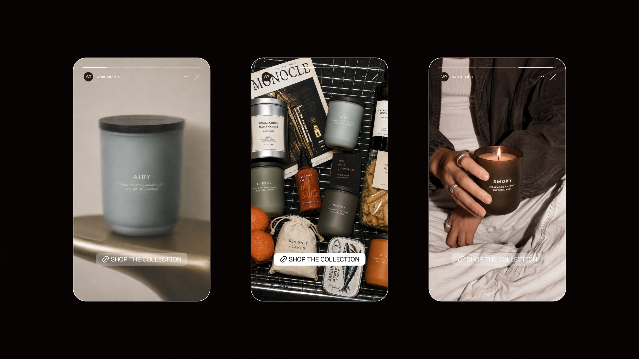
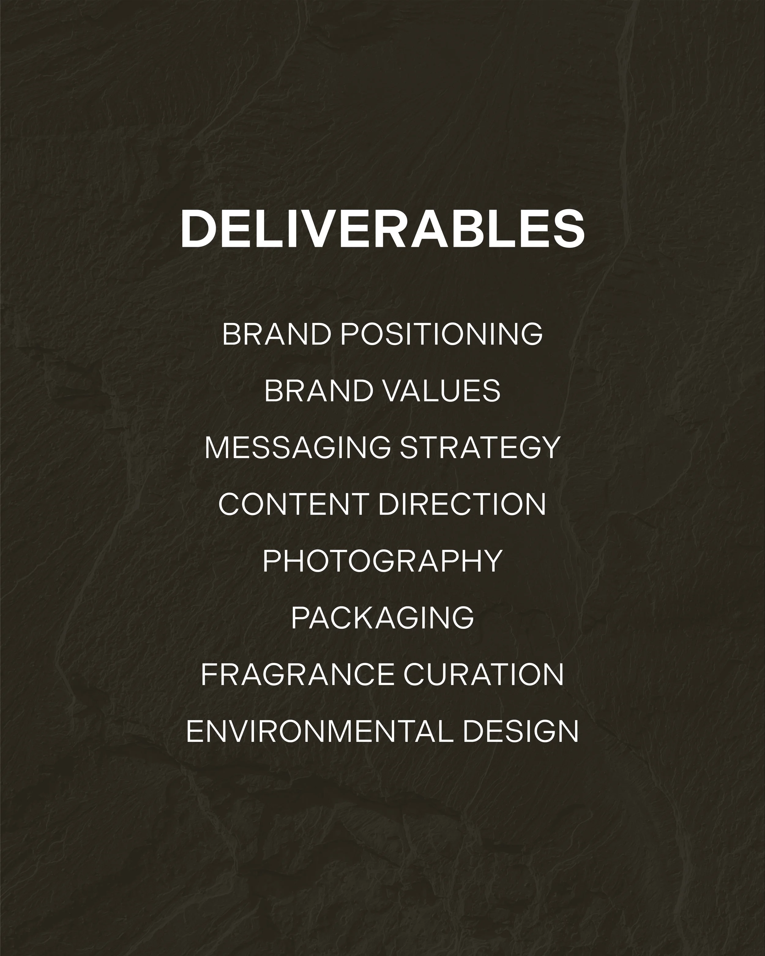
The challenge was centred around building a strategic brand system that aligned messaging, visual identity and product direction under a single, cohesive vision. From brand strategy and verbal identity to typography, collection architecture and creative direction, every element was reworked and developed to create a consistent and scalable brand experience.

BRAND MESSAGING
The messaging strategy was developed to reinforce Wax Republic's positioning as a confident, contemporary home fragrance brand where restraint becomes a defining strength. Guided by the philosophy of 'less is better', communication is direct, intentional and product-led, placing emphasis on fragrance, materiality and refined simplicity. Avoiding overly poetic or decorative language, the verbal identity communicates with clarity, confidence and lasting appeal.
TYPE TREATMENT
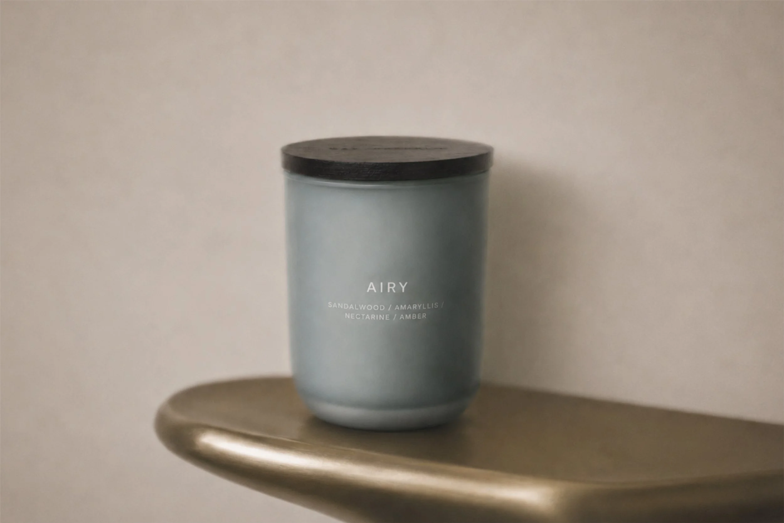
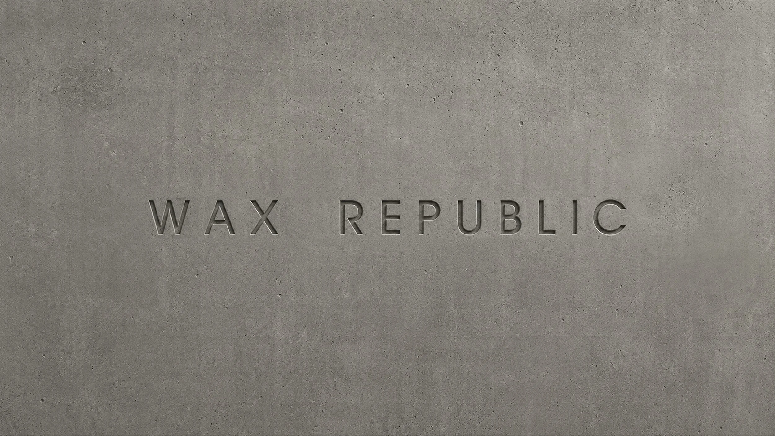
The typographic direction was designed to support the brand's positioning through simplicity and precision. Restrained type treatments and generous use of space create a clear visual hierarchy that prioritises the product while reinforcing Wax Republic's values of confidence, functionality and purposeful design.