Serenity Home Fragrance
Branding / Packaging
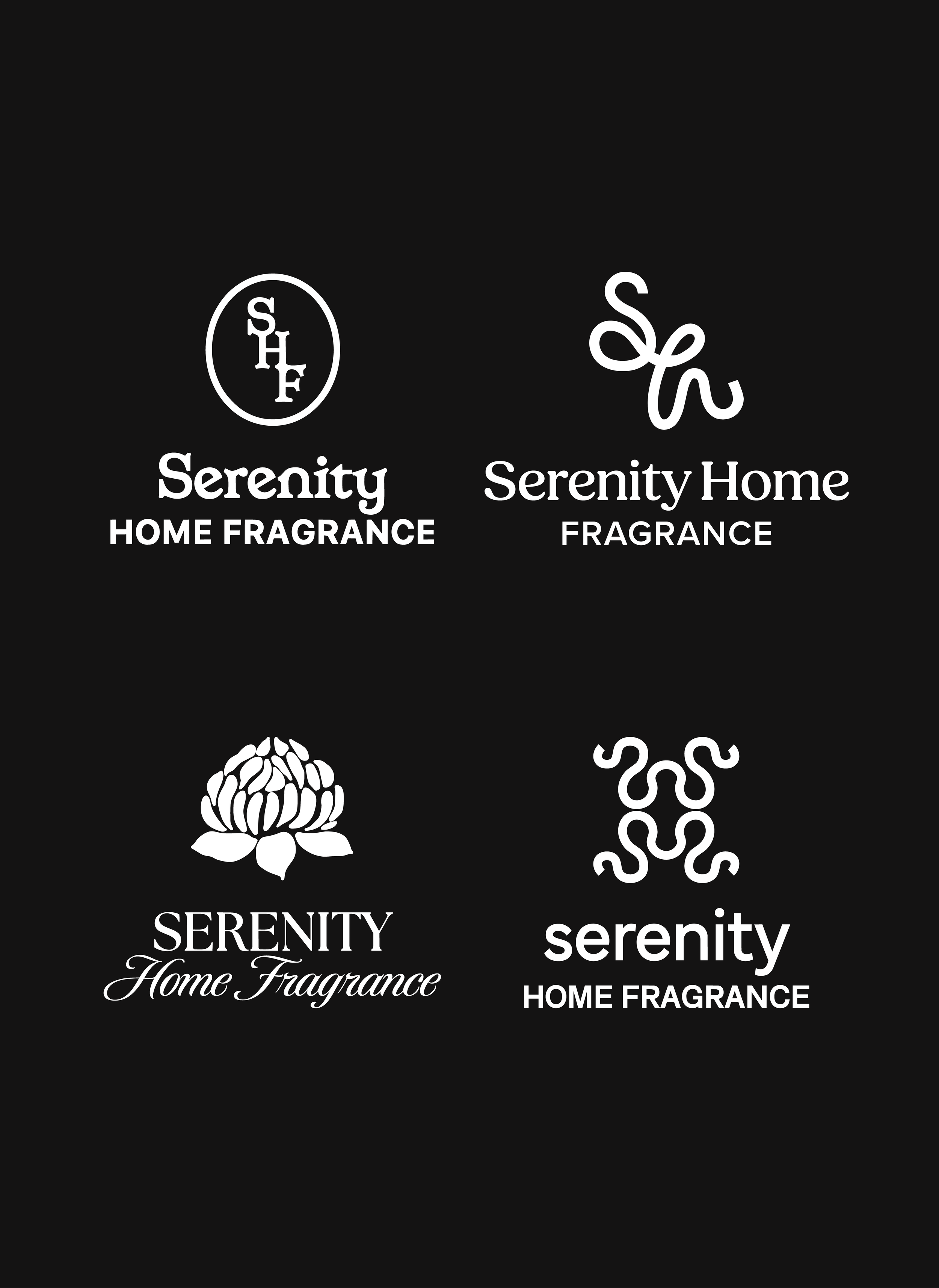
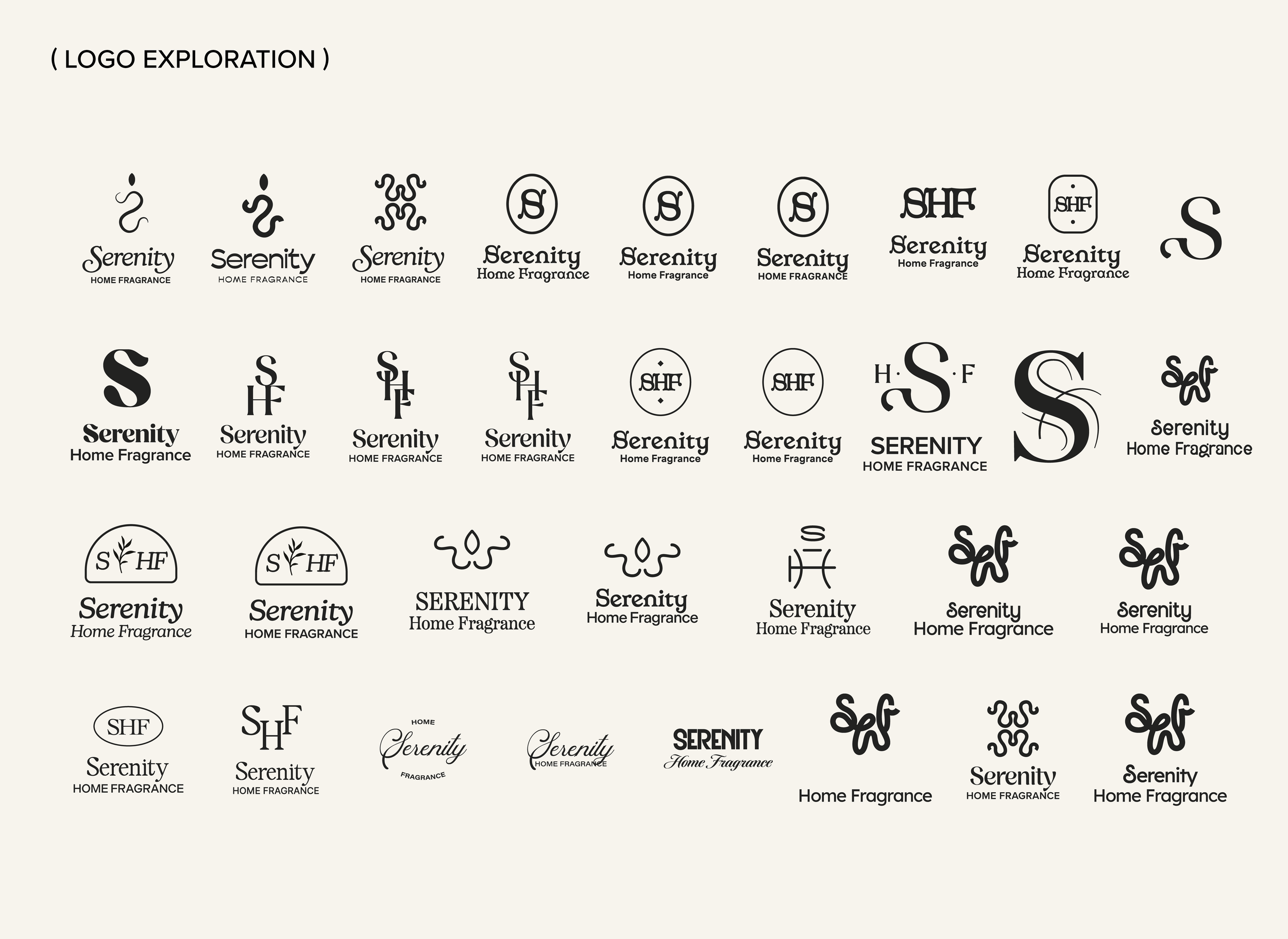
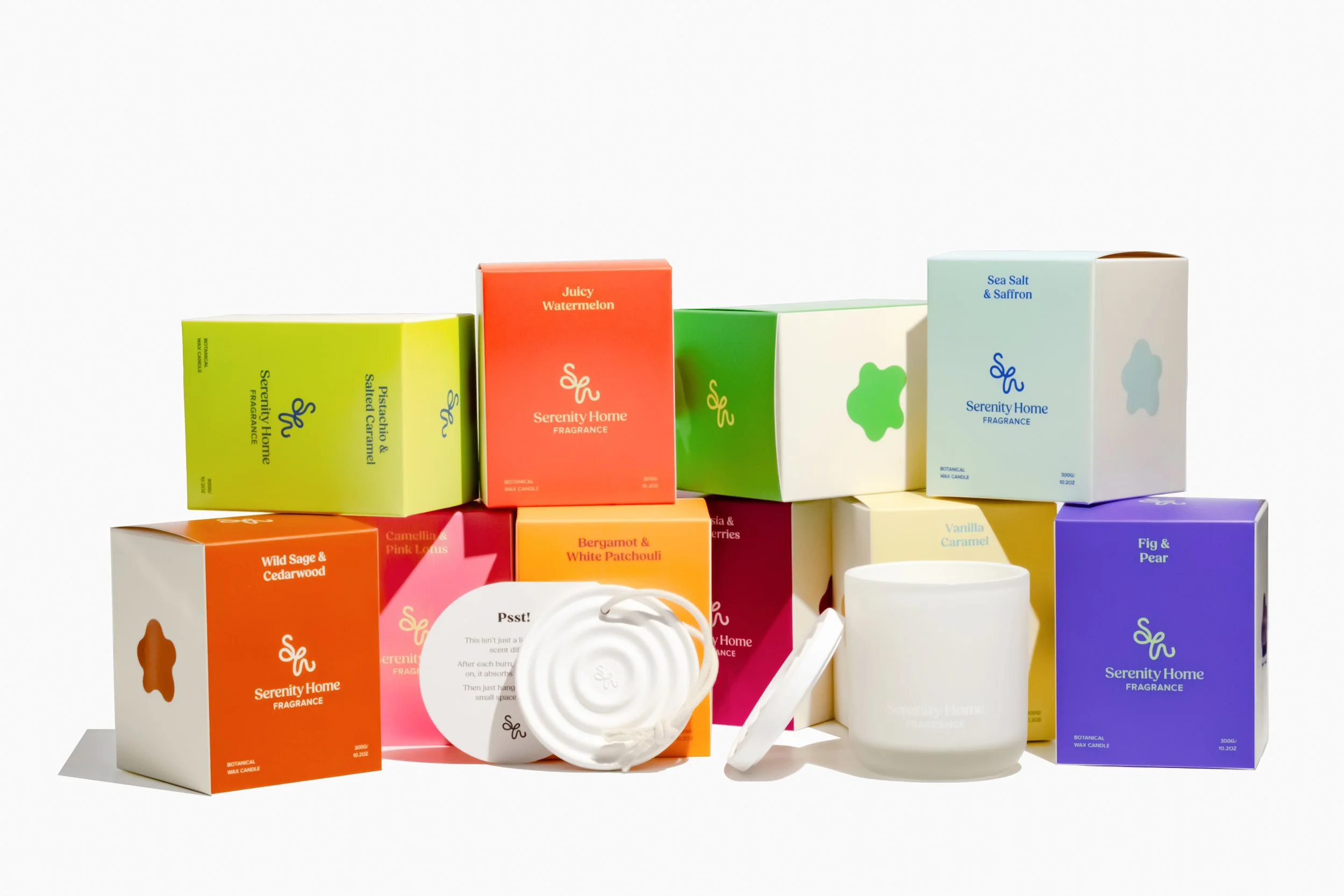
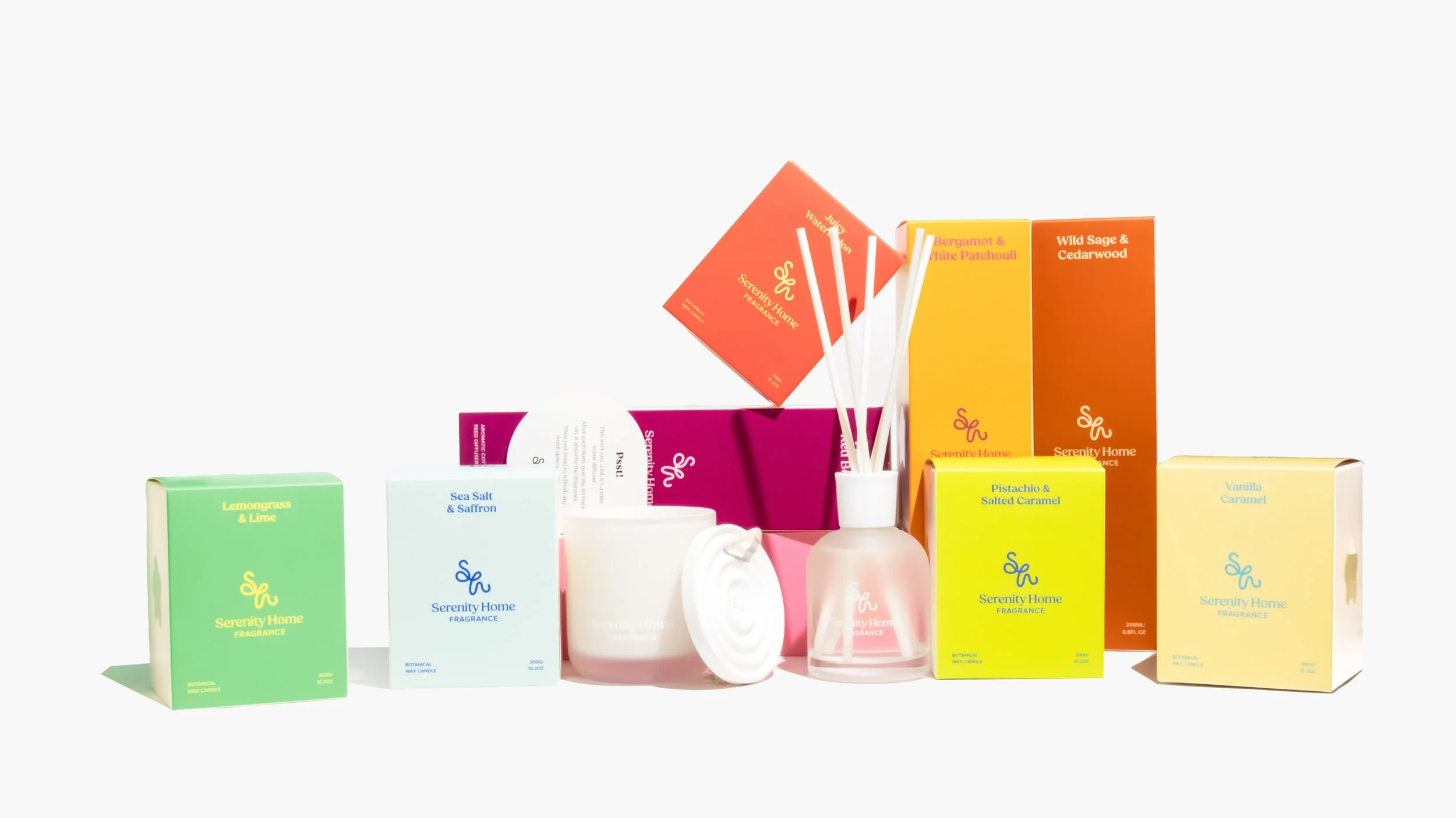
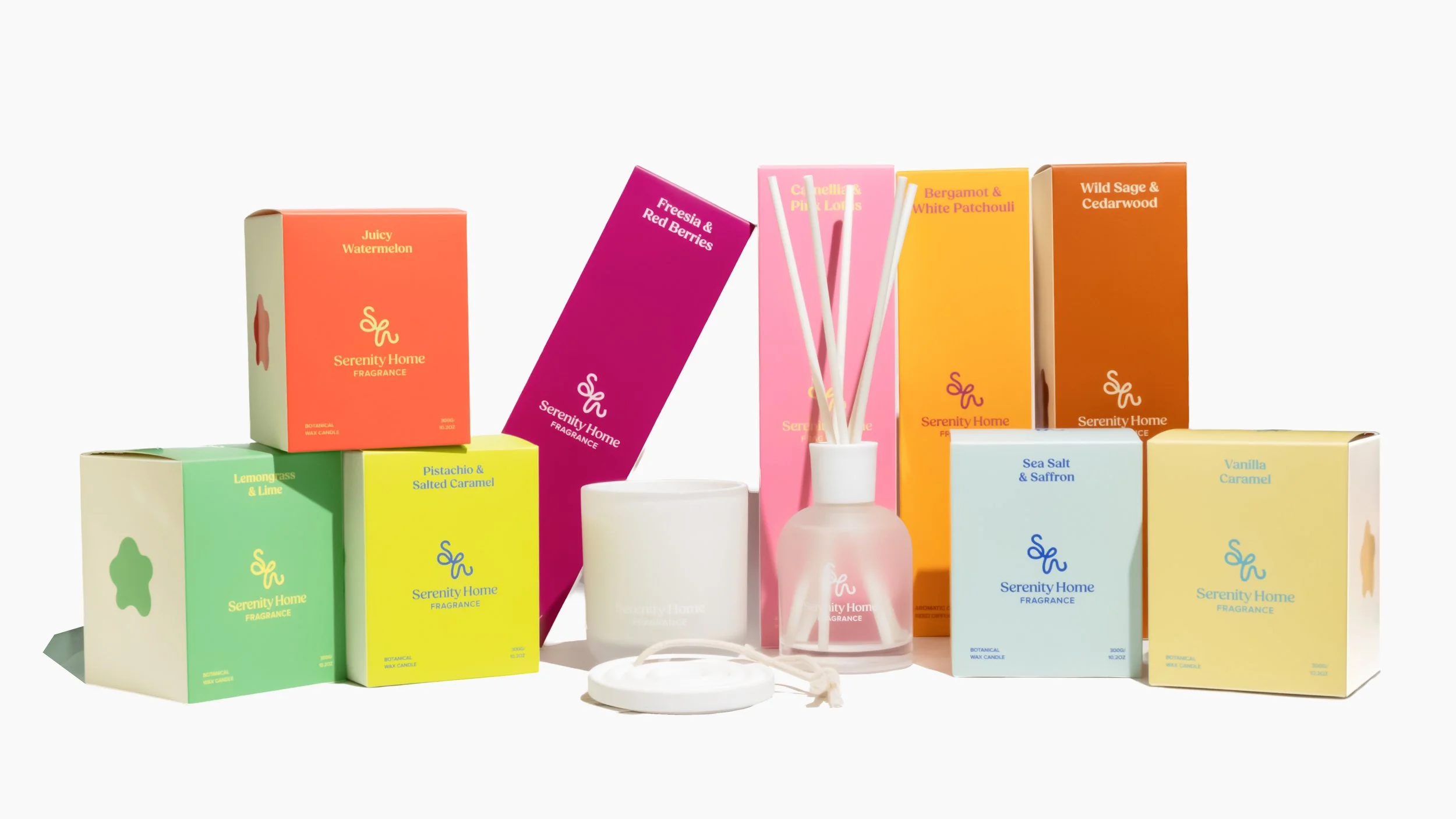
The brief was to present a visual brand refresh, focusing on the logo which felt outdated and irrelevant to the current market, for an established Australian home fragrance brand, ‘Serenity’. Additionally, the client wanted to develop a new Signature Core Collection as a way to launch the new brand visual.
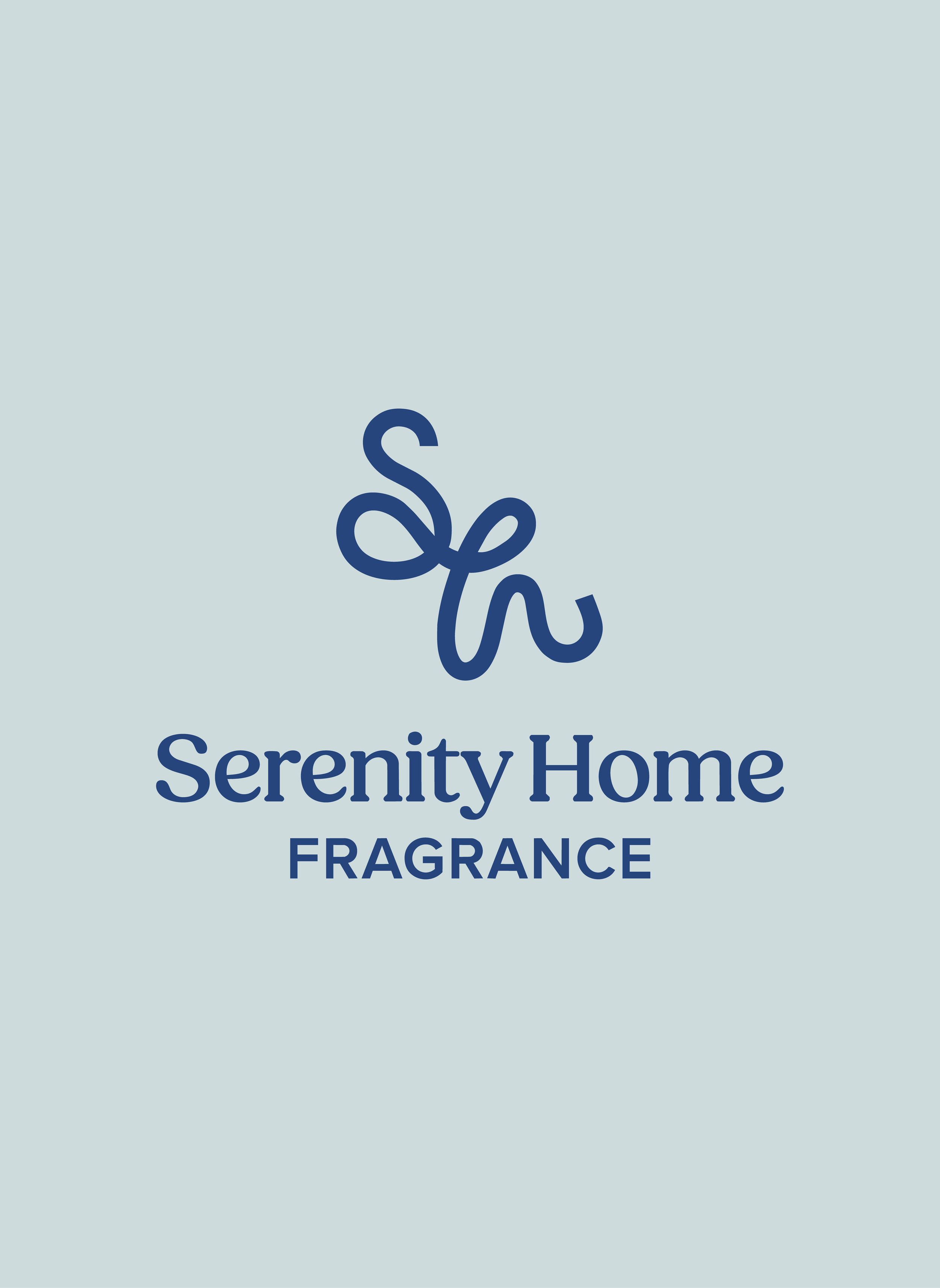
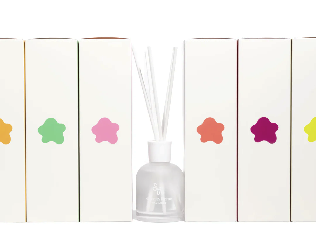
I pitched four approaches to the logo rebranding followed by visual concepts for the look and feel of their packaging that would accompany their logo of choice. An engaging two tone colour approach was chosen that is both eye-catching and trendy. This was a compelling visual concept for the great fragrances they had chosen for their products; the colour combinations are iconic and communicate a sense of ‘deliciousness’ and excitement.